Design for Live-Music.
The Bergfest is a regular event in the club 8Below in the heart of Munich. Every thursday, bands from different genres perform here on stage. So the event needed a design that is on the one hand as flexible as possible and on the other hand visualizes the rough charm of the event location.
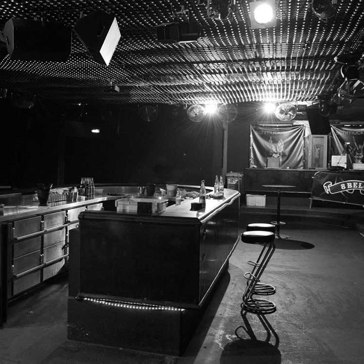
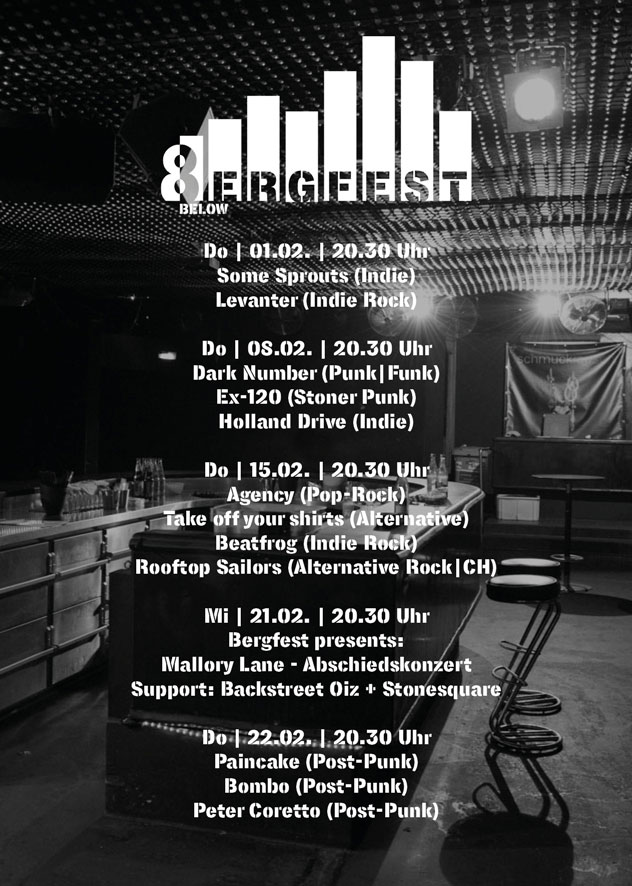
Logo and Key Visual. The Logo connects two metaphors: The mountain, which already occurs in the name of the event, as well as the amplitude of an equalizer, which visualizes sound. The urban, subcultural self-image of the event is supported by the stencil-like style and the font Lorimer No.2. unterstützen das urbane, subkulturelle Selbstverständnis der Veranstaltung. The Key Visual is a black-and-white image by photographer Jean-Marc Turmes, that presents the event location in a genuine way.
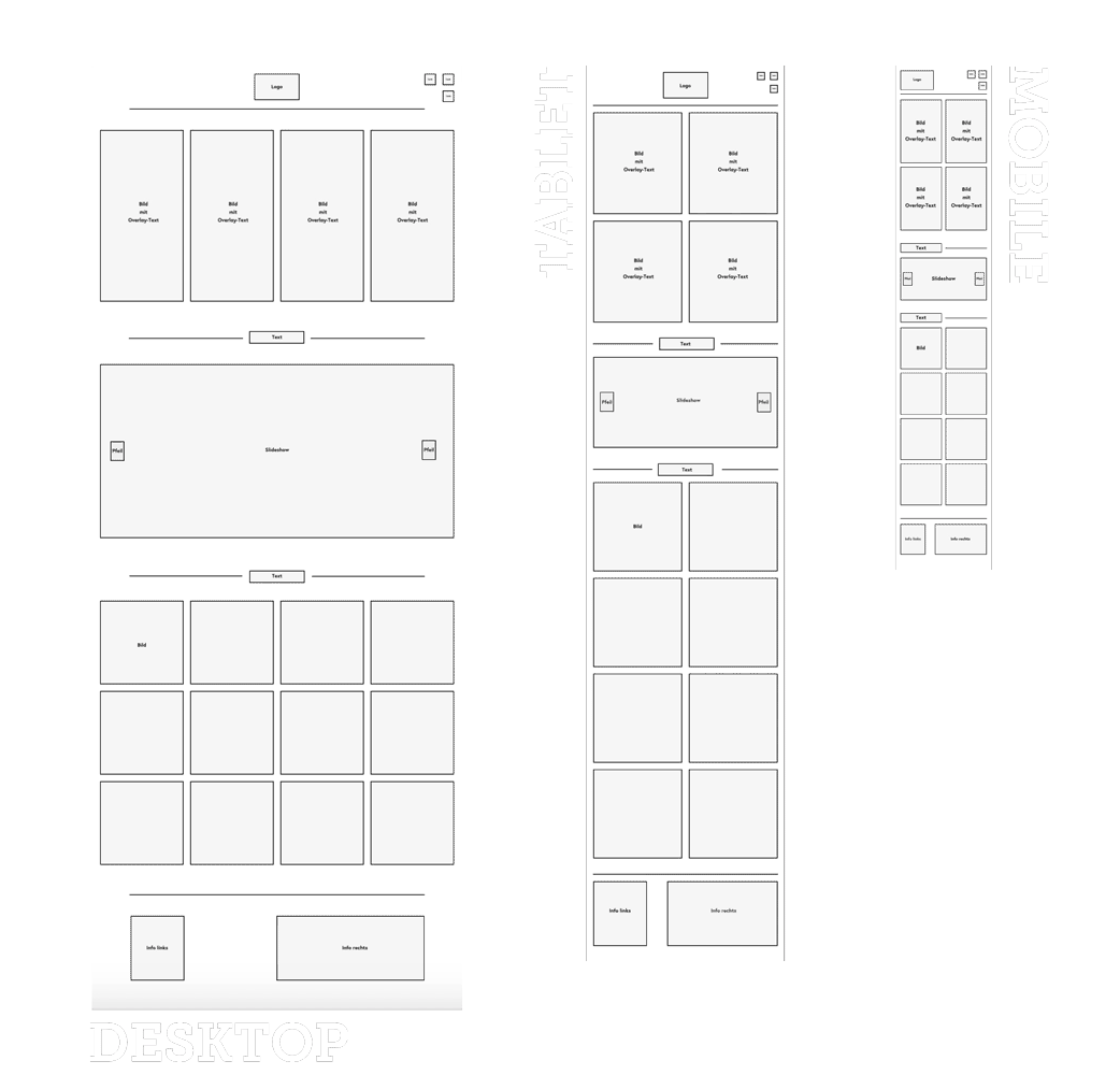
Website. As a foundation for the Bergfest-Website I created some drafts for the visual design and the interactive and responsive behaviour of the website (here is the scheme for the landingpage). Concept and design finally came together in an interactive prototype, which visualized the ideas for the developer.
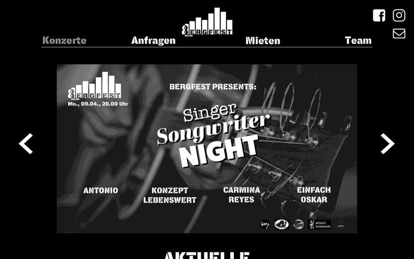
Visual Design. The visual design of the Bergfest-website is mainly shaped by the key visual and presents itself in black and white. So the broad variety of content (i.e. logos and pictures of the bands) can be shown on a neutral platform and appears as one entity.
Information Architecture. The sub-pages of the landingpage emerge from potential Heavy User: visitors that want information about concerts. Bands that want to play a show. Customers that want to rent the location. And last but not least a page that shows the whole Bergfest-team.
Prototype. In this short snippet of the prototype you get an impression how the different components of the landingpage behave.
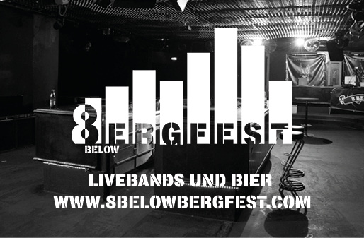
Print. Of course any event needs flyers and stickers. Both are oriented towards the key visual and focus on the essential: the events.
Social Media. The Facebook-page is the main channel of the Bergfest to acquire potential guests. Because of that, there are Facebook-events with individual banners for every concert. The difficulty of designing the banners is to create a homogenous whole out of the broad variety of different band-logos without neglecting the individuality of any band. A grid in combination with a black-and-white picture of the headliner band in the background are building a simple system that ensures both, recognition as well as aesthetic functionality. Here are some examples.
1 | 6
2 | 6
3 | 6
4 | 6
5 | 6
6 | 6